Tuesday, May 29, 2012

Socially Munkee

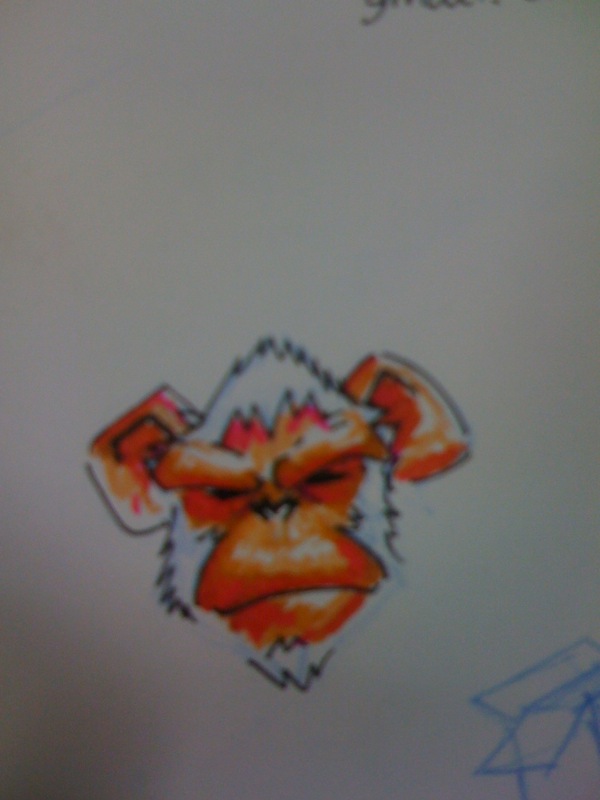
These days I have been associated with a project called 'Social Munkee' which are "Free & Simple" Facebook applications for all. The creator of these applications is Neeraj Kumar, awesome guy and an awesome developer who works with me in the same company. He had the similar apps available earlier with the name 'Elemental apps' but since facebook made major changes in their dimensions, so he had to revamp each and every app of his and named them 'Social Munkee'. So he asked me to do some creatives for the apps along with logo identity as well and since then i have been making and going crazy with monkeys. Here are the screenshots and the logo I designed.


and regarding the same I made a lot of monkeez, I would like to share few of them


The project is still on and we will keep on making more social apps for facebook, more monkeys will join the army.

If you have any suggestions for Social Munkee, feel free to drop in.

Cheers


Monday, May 28, 2012

What The Font!

Recently I have spend a lot of time looking at awesome typography artwork and tried to find out the basics of typography and tried to familiarize myself to fonts. In this process I found out the reason why Helvetica is the best font when it comes to designer and why designers hate Comic sans. What I have learned is that every font, serif or sans serif signifies something.... a certain mood and typography is a different ball game all together. The basics of typography are very interesting ... technical stuff like apex, baseline beak, axis etc which freaks me out. While trying to figure out more about type faces, fonts and typography, I fount an amazing creative which is a Periodic Table of font and Hell Yeah that helps......  these are Must have fonts with Helvetica ruling the chart.


So crux of the matter, I started paying a little more attention towards type faces and fonts. As a result, I have started noticing banner of famous brands to find out the fonts they have used (which is kind of crazy coz in a middle of conversation, I go "Hey they have used 'Century Gothic' "or "Wow nice use of 'American Typewriter' " and rest of people go "What??" ).

Like recently while roaming around in DLF Promenade  (Vasant Kunj) I figured out that the banners on the lift's exterior has used Font called 'Dax'.

Recently I downloaded a bunch of  free handwritten fonts for some projects and used them.....  while playing around, I found a free font called Hands of Sean and used it for a website page for Let's Design Season 4, Cotton Council International's initiative for fashion designers, and thts not all, I felled in love with that font and used it more then twice like for my cover photo for Facebook timeline along wid Klavika (Facebook font)..


My Timeline Cover photo

My creative for Cotton Council International's event Let's Design 4 website. 


The thing that was interesting is that few days later, I found two advertisements on air on TV which were using the same font as their branding like Expedia.co.in  and Lay's new campaign's caption "Pal banaye magical", as well as in intro of a bollywood movie "Ek main aur ekk tu"


Friday, March 23, 2012

Tumblr Makeover

Recently a very famous social media/blogging site Tumblr went through a make over.
Tumblr as most of people might not know is a very vast and useful social media platform especially for artists(CGI, Concept, Painters etc.). This platform is time like a tumbler (just like its name) where you can share your own art pieces, thoughts videos and reblog other artist's work as well.... its like a bucket where you take whatever you like and put it into one place... your archive. I have been a member of Tumblr  for more then a year and I have found a lot of motivational stuff to keep my creative juices flowing.

So now Tumblr went through a little makeover, their interface was already simple and very user friendly but now its even more simple and elegant.


Now they have this unique way to attracting eye by having a great artwork of any artist at welcome page along with Tags category and suggestions for some interesting people to follow. Interestingly they have shifted the Log in & Sign up buttons on the top right corner of the screen which was earlier in the bottom middle  part of the screen with few slides screen shots of the layout.


When it started it used to look something like this.


and later on  before the latest makeover its used to look like this                                                                   


When you click on 'Log in', it takes you the log in menu like in image below.. earlier it was right underneath the slides.  


Earlier it used to look like this . Courtesy: Mashable who covered their previous makeover in year 2008


Then comes the Dashboard, dashboard is still the same except the dashboard icon bar,


which was previous like this :


People are still missing the previous layout but very soon will move on and will get used to.
If you are not a member of Tumblr, then you should register ASAP... its awesome. 

But statutory warning: ITS  HIGHLY ADDICTIVE!